For the better part of a decade, "Modernism" in outdoor design was synonymous with a very specific, very stark binary: Jet Black or Paper White. If you wanted a structure to look contemporary, you painted it black. If you wanted it to look "Hamptons," you went white.
But as we move through 2026, a seismic shift has occurred in the architectural landscape. The harshness of pure black is being retired in favour of something more nuanced, more organic, and psychologically "softer." Enter Anthracite.
This deep, chalky, near-black grey has moved from a niche industrial choice to the absolute gold standard for outdoor structures, louvres, and architectural accents. It isn't just a trend; it is a response to how we want our homes to feel in an increasingly complex world.
Here is the psychological and aesthetic breakdown of why Anthracite has officially claimed the throne.
To understand why Anthracite is winning, we first have to look at why Jet Black is losing its grip. In colour psychology, pure black represents a "void." It is the absence of light. While it certainly provides a high-contrast, "expensive" look, it can also be incredibly oppressive.
In an outdoor setting, a large black structure: be it a pergola, a fence, or a window frame: creates a hard visual stop. It demands that the eye look at it, often at the expense of the garden or the view behind it. Furthermore, black is a thermal sponge. In the Southern Hemisphere sun, black surfaces can reach blistering temperatures, radiating heat back into living spaces long after the sun has set.
Anthracite solves these issues by introducing depth. It is a colour that contains a soul.

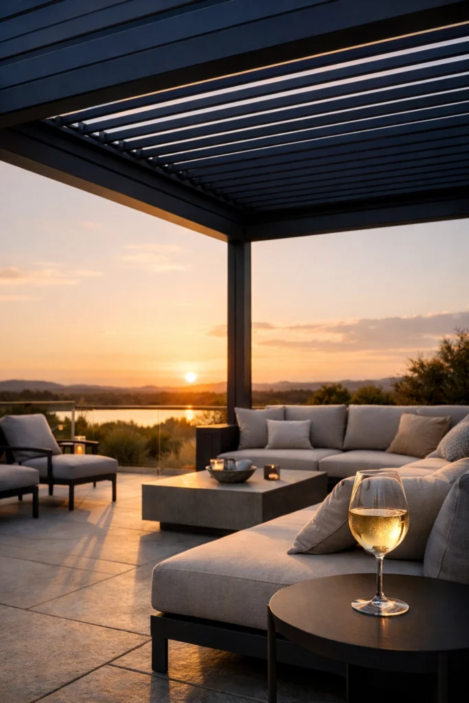
Anthracite is named after the high-lustre coal of the same name. Unlike standard grey: which can often look like wet concrete or a dull office cubicle: Anthracite possesses subtle, often pearlescent reflections. Importantly, Anthracite is a standard colour for louvre kitsets, not a custom one.
Under different lighting conditions, it shifts. In the midday sun, it might reveal a hint of blue or green-grey, echoing the tones of the ocean or the forest. In the twilight, it settles into a warm, velvety dark that feels secure rather than cold. Custom colours are also available for louvre kitsets that need a more tailored palette, with options such as Flaxpod, Grey Friars, and Ironsand commonly specified in a Matt finish.
In 2026, the home has become the ultimate sanctuary. Designers are moving away from "cold" minimalism toward "warm" or "soft" minimalism. We want spaces that feel emotionally supportive.
Psychologically, Anthracite is associated with stability and resilience. Because it is the colour of deep rock and ancient coal, it gives a structure an immediate sense of permanence. However, unlike black: which can feel heavy and "closed in": Anthracite feels "open." Its ability to catch the light makes it feel breathable.
It provides a sense of security. When you are sitting under an Anthracite louvre system or looking through dark grey frames, there is a feeling of being protected without being trapped. It is sophisticated without being arrogant.
One of the most significant reasons architects and landscape designers are obsessed with Anthracite in 2026 is its ability to "recede."
When you design an outdoor space, the goal is usually to highlight the greenery: the lawn, the trees, and the sky. White structures stand out like a sore thumb against green foliage. Black structures create a silhouette that can feel like a silhouette of a building cutting into the horizon.
Anthracite, particularly those shades with a slight green-grey undertone, mimics the shadows found in nature. If you look at a thick forest or a rocky outcrop, the darkest points aren't actually black; they are deep, charcoal greys. By using Anthracite for outdoor structures, the man-made elements "sink" into the background, allowing the natural landscape to take centre stage.

Anthracite is a "neutral" in the truest sense of the word, meaning it doesn't just sit next to other materials: it enhances them.
Anthracite and wood (especially cedar or thermally modified timbers) is the definitive architectural pairing of the mid-2020s. The cool, stable tone of the grey provides a perfect foil for the warm, organic grain of the wood. It makes the orange and red tones in the timber "pop" while the timber prevents the grey from looking too industrial.
Whether it’s raw off-the-form concrete or natural schist, Anthracite bridges the gap between the ultra-modern and the ancient. It matches the tonal weight of stone, creating a seamless transition between the structural frame and the masonry.
Dark frames are a classic choice for glass, but Anthracite frames have a unique advantage: they don't create a "box" around the view. Because the colour is softer, the transition from the frame to the outside world is less jarring to the human eye.
Beyond the aesthetics and the psychology, there are two very "real-world" reasons why everyone is choosing this shade for 2026:
1. The "Dirt" Threshold
White outdoor furniture or structures show every speck of pollen, bird dropping, and dust. Black, surprisingly, is just as bad: showing water spots and salt spray with frustrating clarity. Anthracite is the "Goldilocks" zone. Its textured, matte-charcoal finish hides a multitude of sins, making it the most practical choice for those who want a high-end look without a weekly cleaning schedule.
2. Thermal Performance
While still a dark colour, Anthracite doesn't reach the extreme surface temperatures of jet black. In a climate where we are increasingly conscious of "urban heat islands," choosing a shade that reflects just a fraction more light can make a tangible difference in the comfort levels of an outdoor living area.
If you are planning a renovation or a new build in 2026, here is how to apply the Anthracite philosophy effectively:
As we look toward the latter half of the decade, the shift toward Anthracite represents a maturation of our design language. We are moving away from the "shock" of high contrast and toward the "comfort" of tonal harmony.
In 2026, the goal isn't just to make a statement: it's to make a space that feels right. Anthracite is the tool that allows designers to achieve exactly that. For those ready to move beyond the binary of black and white, the future of design is a very deep, very beautiful shade of grey.


