
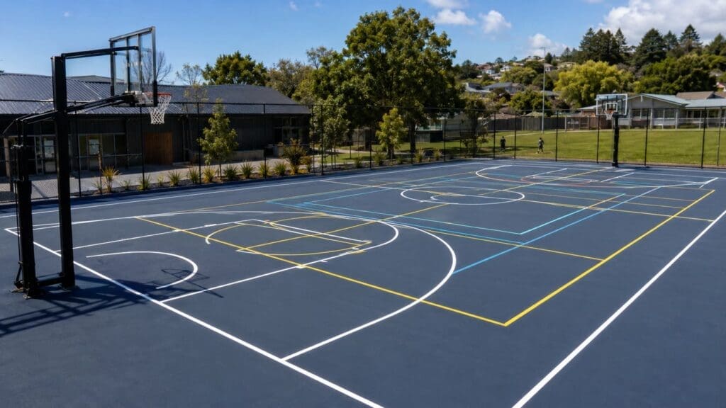
Multi-sport courts are an efficient way to accommodate basketball, netball, pickleball, tennis, volleyball and other activities within a single space. They are especially useful for schools, community centres, recreation facilities, holiday parks and residential developments where available space is limited.
The challenge is that every additional sport introduces another set of boundaries, service boxes, circles and markings. Without careful planning, the finished court can become difficult to read and frustrating to use.
Good multi-sport court design is not about fitting in as many line sets as possible. It is about creating a clear visual hierarchy so players can quickly identify the markings that apply to their game.
Before choosing colours or finalising a layout, identify the sport that will be played most often.
The primary sport should receive the clearest and most visually dominant line system. This normally means:
For example, a school court primarily used for basketball may use highly visible basketball markings, with netball and pickleball lines treated as secondary systems.
Trying to give every sport equal visual emphasis usually creates more confusion rather than a more flexible court.
Just because several sports can physically fit within the same area does not mean every line should be permanently marked.
Three well-planned sports are often easier to use than five or six overlapping layouts.
Before adding another permanent line system, consider:
Occasional activities can often use temporary tape, flat markers or portable court lines instead of adding another permanent colour.
Each sport should have its own distinct line colour. However, the colours should also have different levels of visual strength.
A practical hierarchy may include:
White, yellow, blue and red are commonly used court-line colours, but the best combination depends on the surface colour and surrounding environment.
Avoid selecting colours simply because they represent a particular team, school or brand. Two colours that look different on a sample chart may appear very similar once installed across a large outdoor court.
Court lines must contrast with the playing surface, not just with one another.
White lines may work well against dark blue, green or grey flooring but can become difficult to see on pale surfaces. Dark blue markings may be clear on a light grey court but almost disappear on a dark blue playing zone.
The design should also be checked under actual playing conditions, including:
Outdoor courts can appear very different throughout the day. A line colour that looks clear on a digital layout may be less effective once glare and shadows are introduced.
Using several shades of the same colour family can create confusion.
For example, light blue, medium blue and dark blue may look suitably different on a computer screen. On a court viewed from standing height, however, they may blend together.
It is generally better to use distinctly different colours rather than subtle variations.
Strongly separated colours are also easier for spectators, officials and younger players to identify.
Some court areas are more visually important than others.
These may include:
Too many intersecting markings in these areas can affect player positioning and decision-making.
Where possible, adjust the orientation or position of secondary courts so their lines do not repeatedly cross the most important zones of the primary sport.
Not every sport needs to face the same direction.
A full basketball or netball court may run lengthways, while one or more pickleball courts may be positioned across the width. Volleyball can sometimes be centred within the main court using portable posts and a separate line colour.
Changing the orientation of a secondary sport can reduce direct line overlap, but it must not compromise:
The layout should always be considered as a complete system rather than as several individual courts placed on top of one another.
Consistent line widths help the court look organised and professionally finished.
Different sports may have official requirements that need to be followed for formal competition. For recreational multi-sport courts, consistent visual treatment is still important.
Avoid making secondary lines extremely thin in an attempt to hide them. Lines that are too narrow can become difficult to see, wear faster and look inconsistent after installation.
Current requirements should be confirmed with the relevant sporting body when the court is intended for regulated competition.
Colour blocking can help define major playing areas. For example, a basketball key or pickleball non-volley zone may use a contrasting surface colour.
However, too many coloured zones can be just as confusing as too many court lines.
A clear multi-sport design normally uses:
This approach creates visual structure without turning the court into a patchwork of competing colours.
Some colour combinations can be difficult for players with colour-vision deficiencies to distinguish.
Red and green, for example, may not provide enough separation for everyone. The design should consider differences in brightness and contrast, not colour alone.
Useful strategies include:
A court that remains understandable without relying entirely on colour will generally be easier for everyone to use.
Line design should coordinate with the locations of nets, posts, hoops and sockets.
A visually clear court can still be difficult to use if portable equipment is repeatedly positioned over the wrong line system.
Plan and document:
Simple labels on equipment or a small layout diagram near the court can help staff and users set up each sport correctly.
Court markings should be planned before the playing surface or modular tiles are ordered.
A proper layout plan allows the client to review:
For modular sports flooring, the line plan may also affect tile colours, feature zones and installation sequencing.
Changes are much easier to make on a drawing than after the court has been painted or installed.
When every line is designed to stand out, none of them receives clear priority.
A line layout may physically fit while leaving inadequate room for players beyond the court boundary.
Digital colour samples do not always represent how colours will appear outdoors or across a textured sports surface.
Similar colours can merge visually, particularly from the opposite end of the court.
Court lines, nets, posts and hoops must be designed together.
A colourful layout may look impressive in a rendering but still be difficult to follow during play.
A school recreation area might use:
This arrangement provides flexibility without permanently adding every possible marking.
The exact solution will depend on the court dimensions, age groups, available equipment and intended level of play.
The best multi-sport courts are not necessarily the ones with the most markings. They are the courts where players can immediately understand which lines they need to follow.
A successful design uses clear priorities, strong colour separation and carefully planned overlaps. It also considers surface contrast, accessibility, equipment placement and the amount of space available around each playing area.
By completing a detailed layout before installation, schools, clubs and property owners can create a flexible court that supports several activities without becoming visually confusing.


